Live Board & History Guide
The ThingConnect Pulse web interface provides real-time monitoring and historical analysis of your network devices. This guide covers how to use the dashboard and analyze your monitoring data.
Dashboard Overview
The main dashboard is your central monitoring hub, accessible at http://localhost:8090 after logging in.
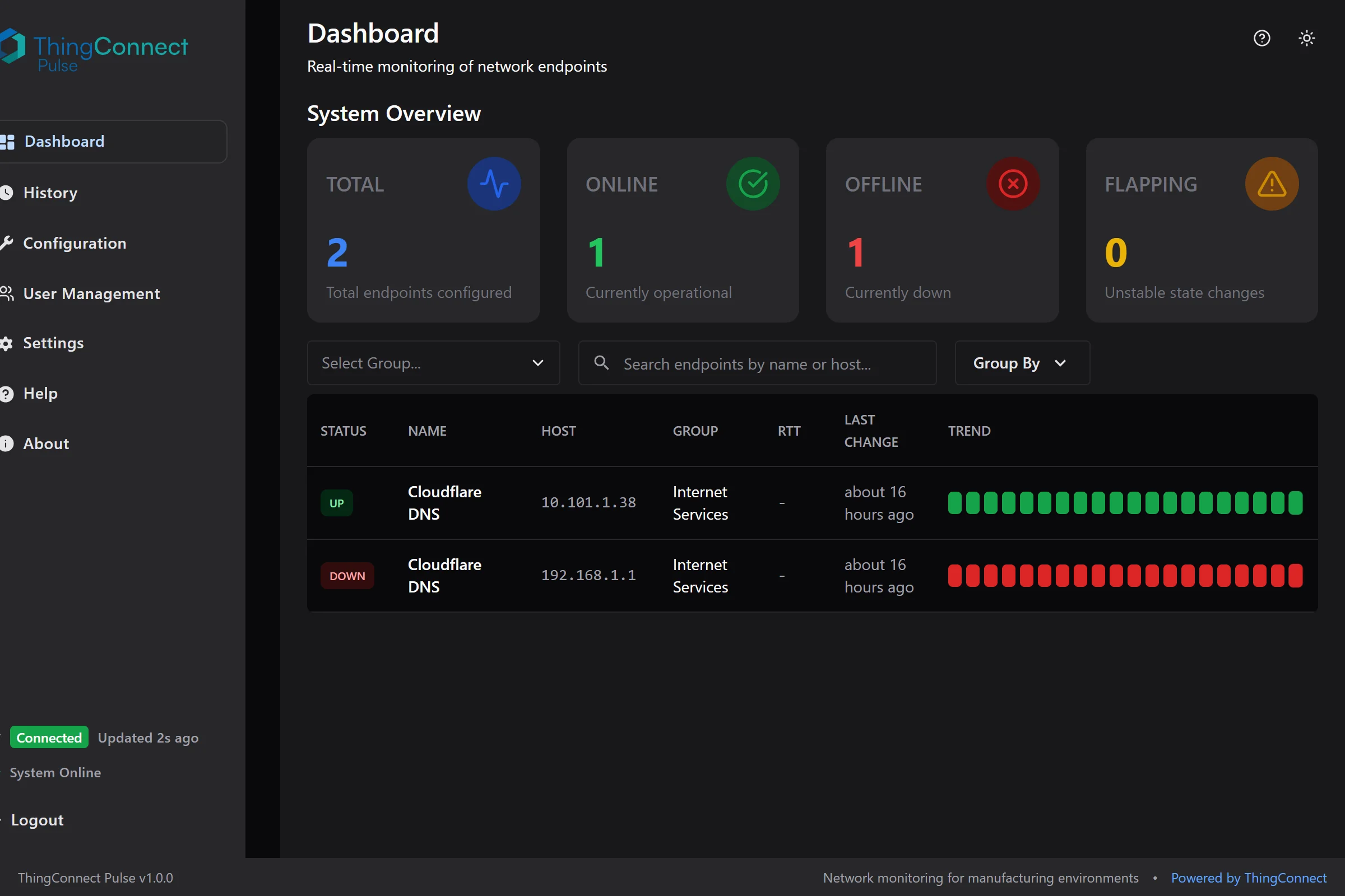
The main dashboard provides a comprehensive view of your network monitoring with real-time status updates and trend visualization.
Key Elements
Live Status Feed
- Real-time status of all monitored endpoints
- Color-coded status indicators
- Sparkline charts showing recent trends
- Last change timestamps
Navigation
- Dashboard: Live monitoring overview
- History: Historical data analysis
- Configuration: YAML config management
- Settings: User management and system settings
Live Status Board
Understanding Status Colors
The dashboard uses color coding to show endpoint health at a glance:
- 🟢 Green (UP): Device is responding normally
- 🔴 Red (DOWN): Device is not responding (2 consecutive failures)
- 🟡 Yellow (FLAPPING): Device status is changing frequently
- ⚫ Gray (UNKNOWN): Status not yet determined
Status Information
Each endpoint shows:
Endpoint Details
- Device name and host/IP address
- Probe type (ICMP, TCP, HTTP)
- Group assignment
- Port number (for TCP/HTTP probes)
Current Status
- Status badge with color coding
- Response time (when available)
- Time since last status change
Recent Trend
- Sparkline mini-chart showing 24-hour status history
- Quick visual indicator of stability vs issues
Organizing Your View
Grouping
Endpoints are automatically organized by the groups defined in your YAML configuration:
groups:
  - id: production
    name: "Production Floor"
    color: "#00FF00"
Groups appear as collapsible sections with:
- Group name and endpoint count
- Custom colors (if configured)
- Expand/collapse controls
Filtering and Search
Search Bar
- Type to filter by endpoint name or host
- Real-time filtering as you type
- Searches across all visible endpoints
Group Filtering
- Click group headers to focus on specific areas
- Useful for large deployments with many groups
Endpoint Details
Click any endpoint name to view detailed information:
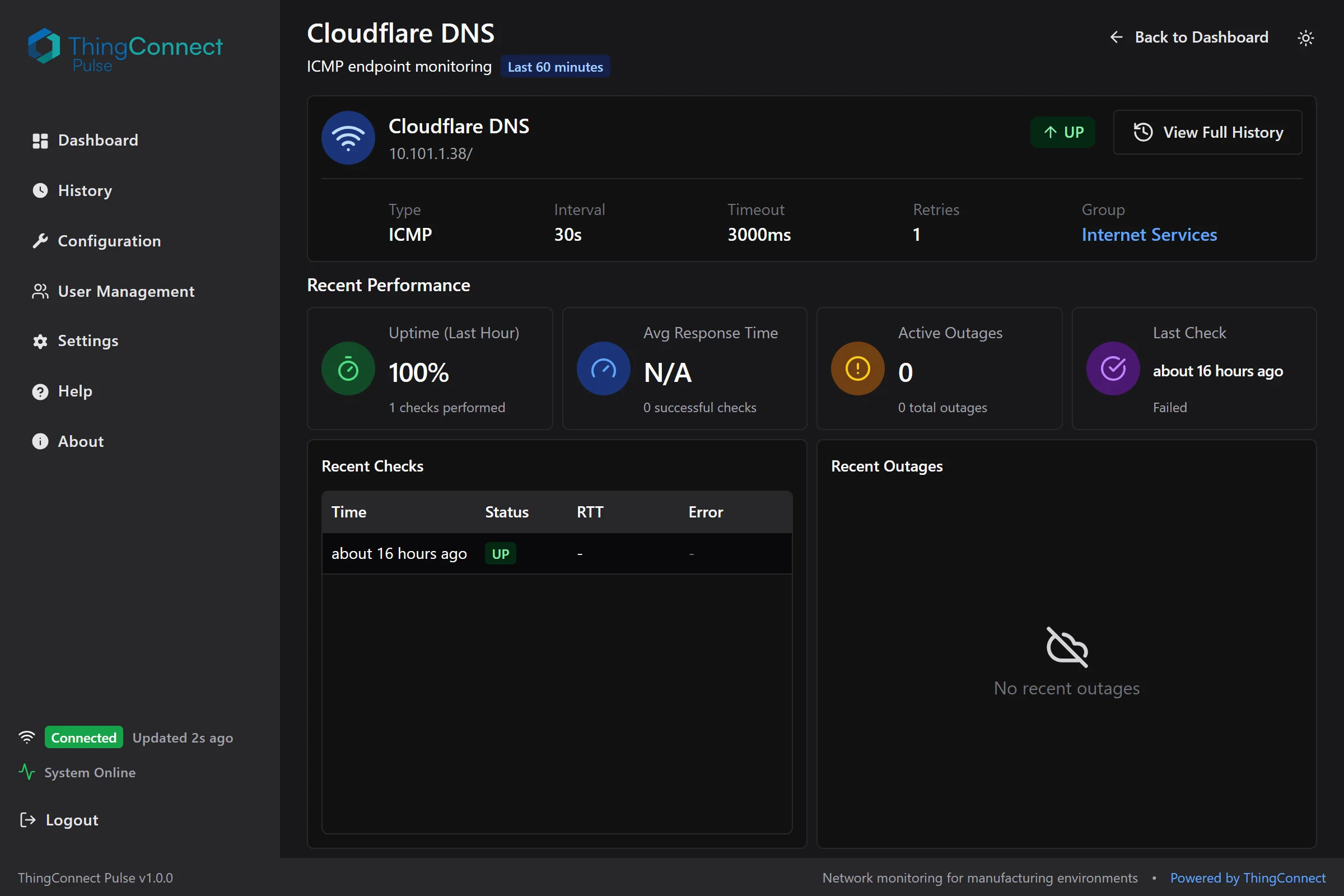
The endpoint detail page shows comprehensive information about a specific monitored device, including configuration, recent performance, and check history.
Endpoint Information
Configuration Details
- Monitoring type and target
- Check interval and timeout settings
- Current probe configuration
Current Status
- Real-time status with color coding
- Latest response time measurement
- Error details (if device is down)
Recent Activity
Recent Checks Table
- Last 60 minutes of probe results
- Timestamps, status, and response times
- Error messages for failed checks
- Automatic refresh every 30 seconds
Outage History
- Recent outages with start/end times
- Outage duration calculations
- Last error message captured
An outage starts after 2 consecutive failed probes and ends after 2 consecutive successful probes. This "flap damping" prevents brief network hiccups from triggering false outage alerts.
Historical Data Analysis
Navigate to History for detailed trend analysis and reporting.
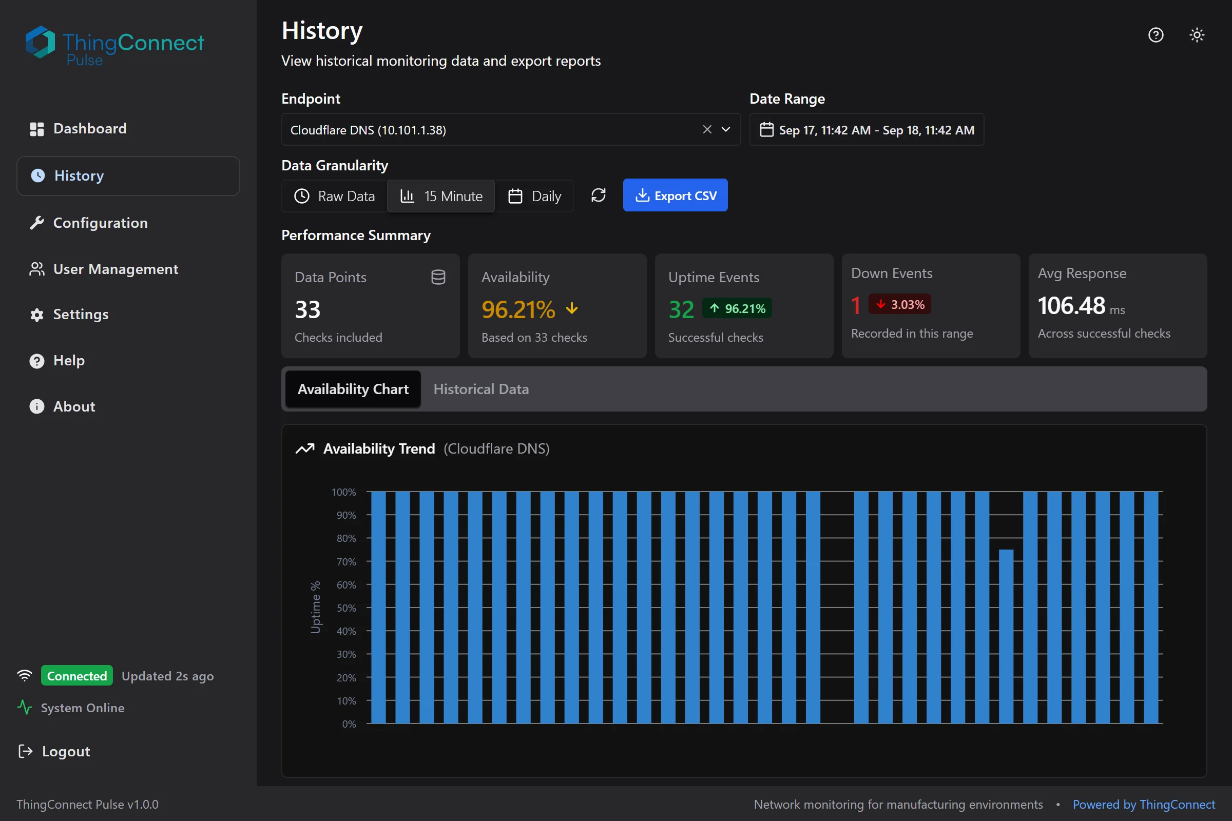
The history page provides comprehensive data analysis tools with performance summaries, availability charts, and CSV export capabilities.
Data Time Ranges
Quick Ranges
- Last 4 hours
- Last 24 hours
- Last 7 days
- Last 30 days
Custom Range
- Select specific start and end dates
- Useful for incident analysis or reporting periods
Data Granularity (Buckets)
Choose the appropriate data resolution:
Raw Data
- Individual probe results
- Most detailed view available
- Best for troubleshooting specific incidents
- Available for last 60 days
15-Minute Rollups
- Quarter-hour aggregated statistics
- Shows uptime percentage and average response time
- Good for daily and weekly trend analysis
- Unlimited retention
Daily Rollups
- Daily summary statistics
- Ideal for monthly and quarterly reports
- Long-term trend identification
- Unlimited retention
Availability Charts
Interactive charts show:
Uptime Percentage
- Green bars indicate uptime percentage for each time period
- Higher bars = better availability
- Quick identification of problem periods
Response Time Trends
- Line chart showing average response times
- Helps identify performance degradation
- Useful for capacity planning
Historical Data Table
Detailed tabular view with:
Columns
- Timestamp or time bucket
- Status or uptime percentage
- Response time measurements
- Downtime event counts (for rollups)
Features
- Sortable columns
- Pagination for large datasets
- Direct correlation with chart data
Data Export
CSV Download
Export historical data for external analysis:
- Select endpoint from dropdown
- Choose date range for export
- Select data bucket (raw, 15m, or daily)
- Click Download to get CSV file
Export Contents
Raw Data Export
- Timestamp, status, response time, error message
- One row per probe execution
- Suitable for detailed incident analysis
Rollup Data Export
- Time bucket, uptime percentage, average response time, down events
- Aggregated statistics for trend analysis
- Perfect for management reporting
Large date ranges with raw data may take time to export. For better performance with long periods, use 15-minute or daily rollups instead.
Dashboard Tips
Efficient Monitoring
Focus Areas
- Pin critical systems to top groups
- Use color coding to prioritize attention
- Set up logical grouping by function or location
Quick Health Checks
- Scan for red (DOWN) status indicators
- Look for yellow (FLAPPING) endpoints that need attention
- Check sparklines for recent trend changes
Troubleshooting Workflow
- Identify issues on main dashboard
- Click endpoint name for details
- Review recent checks for error patterns
- Check outage history for frequency
- Use History page for trend analysis
- Export data if needed for deeper analysis
Performance Monitoring
Response Time Trends
- Monitor for increasing response times
- Identify peak usage periods
- Plan capacity upgrades based on trends
Availability Patterns
- Track uptime percentages over time
- Identify recurring outage windows
- Measure improvement after changes
Mobile and Responsive Access
The dashboard works on tablets and mobile devices:
- Responsive design adapts to screen size
- Touch-friendly controls for mobile use
- Essential information prioritized on small screens
- Full functionality available across devices
Refresh and Real-Time Updates
Automatic Refresh
- Dashboard updates every 30 seconds
- Live status changes appear automatically
- No manual refresh needed for current data
Manual Refresh
- Refresh button available for immediate updates
- Useful when troubleshooting active issues
- Force update of all endpoint status
Next Steps
- Data Model: Understand how your data is organized
- Rollups and Outages: Learn about analytics and reporting
- Troubleshooting: Resolve monitoring issues
- API Reference: Integrate with external systems